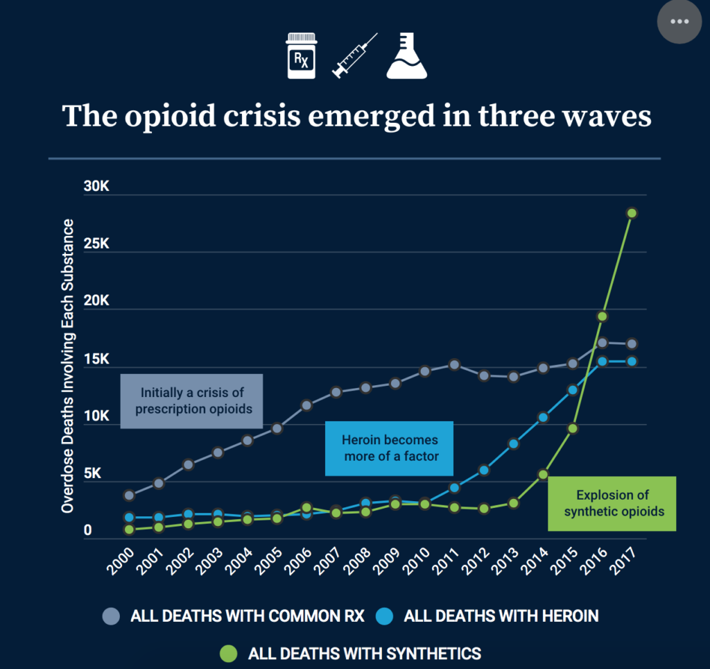
Most people who spend time in health care are aware of the opioid crisis. But how bad is it really? The National Institute for Health Care Management (NIHCM) Foundation provides a number of interactive graphs to quantitatively describe how the opioid crisis has evolved between 2000 and 2017. For instance, the the graph below shows how the opioid epidemic started with prescription pain killers, then moved on to heroin, and now the biggest threat are synthetic opioids such as fentanyl.
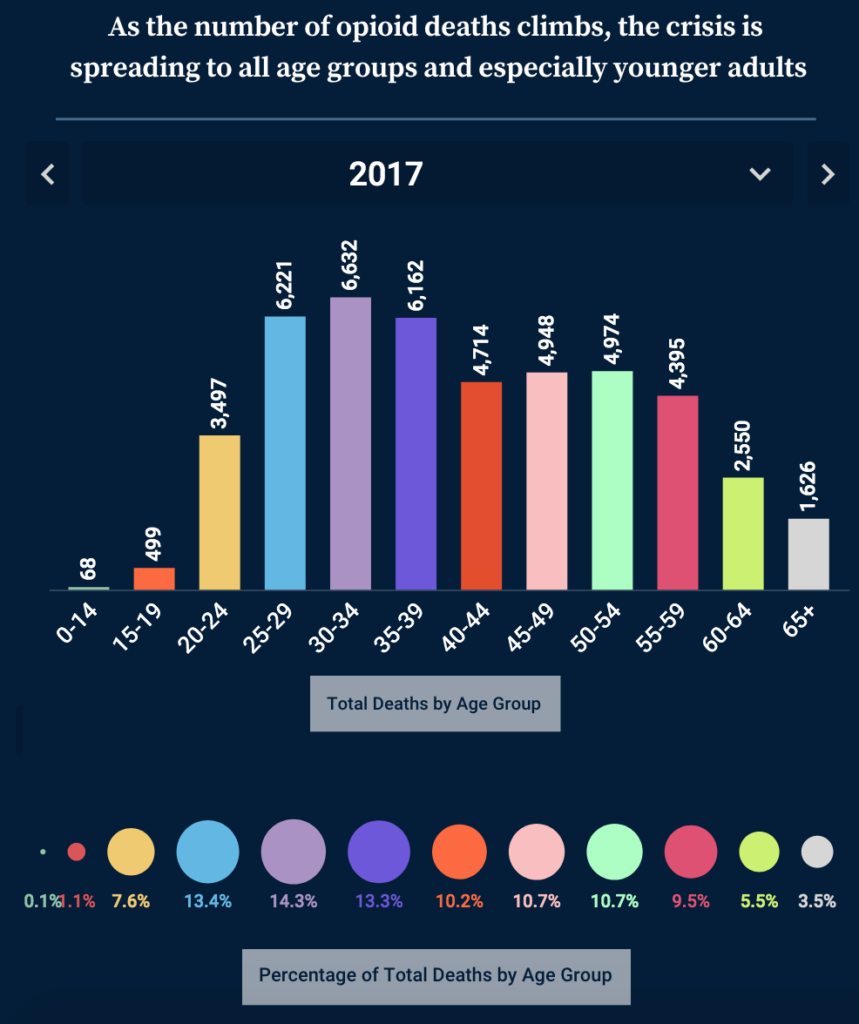
Also, the opioid crisis doesn’t only affect the young. Almost 3 in 10 opioid-related deaths occur in individuals aged 50 and above.
You can find additional graphics and statistics here.
Where did these statistics come from? The NIHCM website notes:
Data on opioid overdose deaths were derived from the multiple cause-of-death files of the Wide-ranging Online Data for Epidemiologic Research (WONDER) data system maintained by the Centers for Disease Control and Prevention (CDC).
The opioid crisis in numbers posted first on http://drugsscreeningpage.blogspot.com/
